

The toolbar above your live mockup — details, type, history, share, and deploy
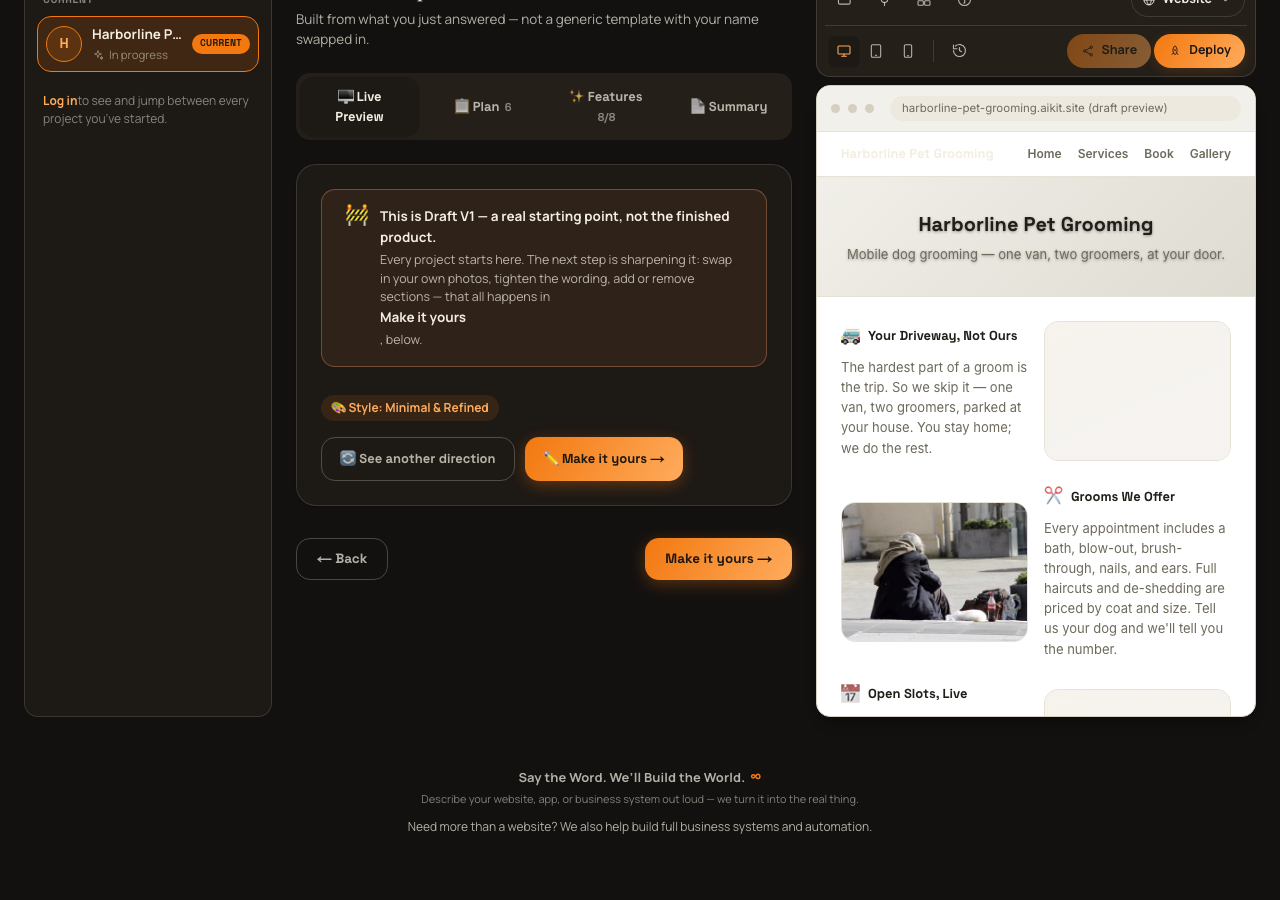
Once you have a project, a persistent toolbar sits above the real mockup of your site in the right-hand column, on screen throughout building and refining — not just on one tab. This guide walks through every control in it, including which pieces are real and which are honestly marked as not built yet.
The right-hand column header — Project Outline and Annotate
Above the toolbar itself, two pill buttons sit in a header row. "Project Outline" swaps the whole right column between the live mockup and the Project Plan panel described in "Reading your plan." "Annotate / Leave feedback" is honestly marked coming soon — clicking it opens a small popover explaining that in the future you'll be able to draw a circle right on the preview and leave feedback exactly where you see it; nothing behind it works yet.
Row 1 — Files, Plugins, Skills, Details, and Type
Three icon buttons — Files, Plugins & integrations, and Skills & capabilities — are all honestly labeled coming soon. Each opens a small popover explaining what it will eventually do (browsing every real file behind your project; one-click connections to tools like Stripe, Klaviyo, and Calendly; turning your project's own AI abilities like SEO tagging or translation on or off) with a plain "Coming soon" tag. None of the three do anything real yet.
The Details button is real: it opens a popover listing your project's actual live data — Name, Description, Type, Style, Audience, Goal, Status, and Plan (currently always "Free preview") — a quick read-only snapshot, not an editor.
The Type control at the end of the row shows your project's current type (or, if you picked more than one, the first type's label plus a "+N" count) with a dropdown chevron. Opening it lists every project type as a checkbox row — checking or unchecking one genuinely changes your project's type immediately, both on screen and saved to your account, not just a local toggle.
Row 2 — viewport, history, share, and deploy
A group of three buttons — Desktop, Tablet, Mobile — actually resizes the live mockup frame to that width so you can check how your project reads at each size. This is a real, working control.
The History button (a clock icon) opens a real, read-only "Version history" popover, pulling your project's actual saved revisions. Each entry shows a colored status dot, a plain-language summary of what changed (prefixed "Not applied —" if aiKit flagged that request instead of making the change), and a relative timestamp like "2h ago." You can browse past changes here, but there is no restore or roll-back button — it's a record you can look through, not something you can undo from.
The Share button is disabled with an explanatory tooltip ("Publish your project first to get a shareable link") until your project is actually published. Once it's live, clicking it opens a popover with your project's real public address in a read-only field and a Copy button that flashes "Copied!" for a couple seconds after you click it.
The last button is either "Deploy" (before you've published — enabled only once your draft has real content, disabled otherwise with a tooltip telling you to build your project first) or "Live" (after you've published — a genuine link straight to your live site, opening in a new tab). Clicking Deploy doesn't start a separate process; it hands you into the same publish flow covered in "Creating your account and publishing."
Have a quicker, specific question instead? Check the FAQ.